
ClassCars
Google Classroom + Lyft
PROJECT
Combine 2 unrelated apps to encourage a new behavior
COURSE AND PROFESSOR
Time Studio 2: Behavior • Michael Chanover
TOOLS
Figma • Mural • Photoshop • After Effects
WHAT I DID
Sketches • Wire-frames • Prototypes • UI Design • User Testing • Personas • FTUE Design • Video Editing • Micro-interactions
DURATION
7 weeks; October 2021 - November 2021
PROBLEM STATEMENT
How Might We encourage ride-sharing between university students?
MASHUP
Strategic design choices can lead to behavior changes in users
ClassCars is a mobile app mashup of features from Google Classroom and Lyft. In essence, it is a ride-sharing service for college students on large campuses that allows them to get to get to shared classes together while making some extra cash.
When selecting two apps for this project, I thought about the kind of behavior I wanted to encourage, and looked into the climate crisis as a problem space. Ride-sharing as a climate solution immediately came to mind, so I chose Lyft as one of the apps. I then looked at the apps I already had on my phone and picked one at random I was familiar with: Google Classroom.
Lyft
Lyft is a mobile app that offers vehicles for hire, motorized scooters, a bicycle-sharing system, rental cars, and food delivery. The features that stood out to me were the map showing nearby rides and the ability to request and pay for rides.
Google Classroom
Google Classroom is a learning platform for teachers and students that aims to simplify creating, distributing, and grading assignments. The features I initially wanted to include were the classes panels, assignments, and social aspect.
RESEARCH
Ride-sharing can reduce car emissions between 34% and 41% per year.
Secondary research on ride-sharing + students
To figure out who the target audience of this app could be and who I could model a persona for, I did some research. This is what I found out:
-
About 25% of US citizens use a ride-sharing app at least once a month
-
87% of university students commute to classes
-
43% of university students work part-time
-
It's estimated that ride-sharing helps reduce car emissions between 34% and 41% per year per each household using these services
Primary research: interviewing my classmates and other college students
Since most college students seemed to need to commute to class, and being in college myself (at the time), I found it easy to recruit participants to weigh in on the idea of a ride-share app for students. Below are the insights I got from talking to fellow students:
-
A commute service would be more useful to students in large universities than those in smaller schools like mine (CCA)
-
Many liked the idea of being able to make some extra cash
-
Being able to choose to ride with other students from the same class and discuss homework could be an appealing feature
A persona to define parameters
Finally, I synthesized my secondary and primary research into an easily digestible persona. This is what I used to guide my initial design decisions of the product.

Persona for average ClassCars user; Figma
MAIN FEATURES
What features get mashed up?
Figuring out the different product features I could mashup from each app was what I spent most of my energy on in the initial stages of this project. These were the three main ideas:
-
Students can drive other students going to the same location as them and get paid for it
-
Students can get rides with other students going to the same location and ask questions about their classes if they share any
-
Users can view classes and their locations on a map by entering their school's name to find specific rooms and buildings
Rough hand sketches
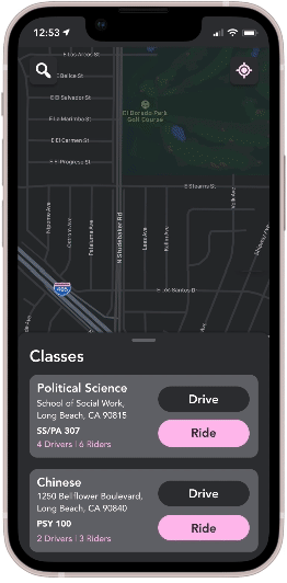
I sketched out some of the screens I thought the app should include based on the envisioned features. I looked through Google Classroom and Lyft and their visual styles and UI components and thought about how the micro-interactions could be combined in this new app. I wanted to use the 'class' panels from Classroom and the central map function from Lyft, so I created a 'Classes' card that users would swipe up on when choosing a destination.
After choosing a class, users would be directed to a thorough map of the campus, including buildings and room numbers, and view assignments. If there is a group project, they could select which group member will be driving and schedule with others through this app. I eventually decided against this feature though, as it might not be frequently useful enough to be necessary.

Sketches of possible screens; Graphite
Wire-framing the main screens
In Figma, I brought in screenshots of the two apps to reference, as well as some from Apple Maps and the CSU Long Beach app.

References used; Figma
As I created the Figma prototype, I took inspiration from the color scheme Lyft uses. I took the Lyft magenta and changed it to a softer pink to complement Classroom's rounded aesthetic, and created an overall calming visual design. The features I created micro-interactions for were searching for a campus, selecting to drive others, and selecting a driver to ride with. Below is a rough cut of the prototype.
Rough cut of prototype; Figma
I received some feedback from my professor and classmates, mainly about visual design decisions (text size, color contrast, card layouts), and edited the prototype based on their suggestions. Below are the final prototypes for the main app features.
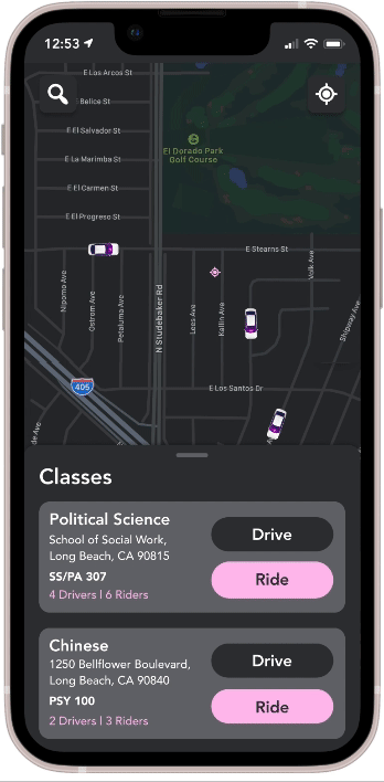
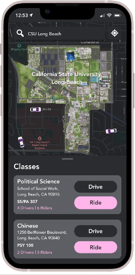
Searching for a campus; Figma
Driving flow; Figma
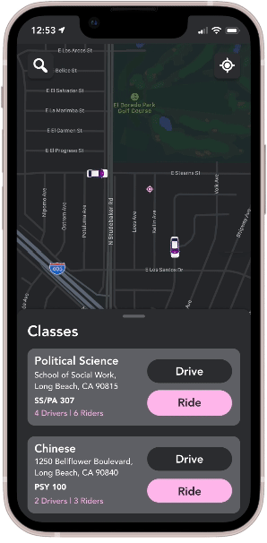
Riding flow; Figma
FTUE (FIRST TIME USER EXPERIENCE)
Intuitive apps have intuitive onboarding
The second half of this mashup project was to design a first time user experience for the app. Our class started out by listing out what we thought were the features of a good FTUE.

Group brainstorm of what makes a good FTUE; Mural
Sketching out the FTUE flow
When starting my FTUE concept, I thought about which features I wanted to highlight, as well as how to do so. Here were the main ideas I wanted to include:
-
Brief overview of ClassCars and the value it will add to a user's life
-
Users sign in through their Google account so the data from Google Classroom can quickly and easily transfer over to ClassCars
-
Users can choose to enable location services and notifications, which will build trust and respect privacy
-
A short walkthrough of the app and its main features
Before sketching any screens, I deleted and re-downloaded Google Classroom and Lyft to my phone to see what the FTUEs of these apps were. I used this as inspiration and as a reference for what elements I could mash up together for the ClassCars FTUE.
In the sketches on the right, I was trying to figure out the tutorial portion of the FTUE. I thought the best way to introduce the various features to the user would be to have a small box of text explaining an action they could take as well as highlighting the part of the screen I want them to interact with. Not all of these screen ideas made it to the final set, but this was the starting point.

Sketches of possible screens; Graphite
Wire-framing the FTUE
I moved into Figma to create the FTUE prototype. My main focus was making sure the user could get through it quickly and efficiently, so I tried not to overcomplicate steps in the process. I also made sure to stay consistent with the look and feel I had defined in the first half of this project so that the experience wouldn't feel fragmented.

Connect to Google account; Figma
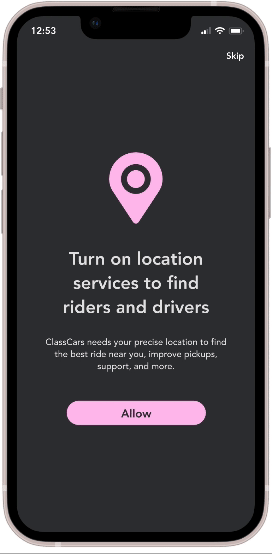
Enable services; Figma
Walk-through; Figma
Testing out the FTUE on my target users
After finishing a preliminary Figma prototype, I recruited 3 participants to test what I had with. I asked questions about the FTUE process, the screens, the design choices, the simplicity, the speed at which it was finished, what they thought worked well and what didn't. These were the main insights:
-
The overall visual design is pleasing, and the pink felt soothing to all the participants.
-
Signing in through Google was straightforward and understandably necessary. While an FTUE should try not to force users to create an account, the ability to use a pre-existing account was the best alternative.
-
The onboarding screens (location, notifications, payment) were fast and easy to get through.
-
The text in the tutorial was a bit too small so it was hard to read for one participant.
-
It was hard to tell which visual components were highlighted during the tutorial.
-
The lead-in from the onboarding screens to the tutorial didn't need a static screen with buttons for users to move the process along with.
Experiments and their revisions
Before committing to the final screens, I experimented with a few ideas in Figma. These were shown to the testing participants and changed after I received feedback. Below are some of the choices I decided against and what I replaced them with.
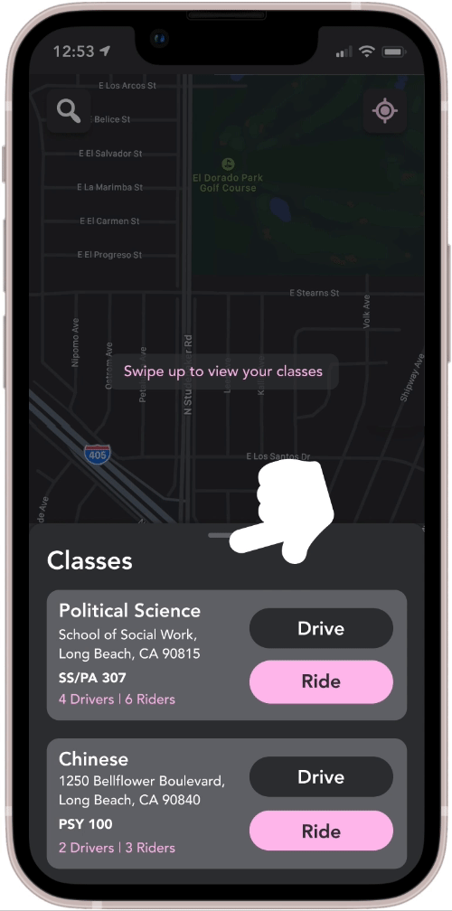
Initial swipe; Figma

Revised swipe; Figma
One of the first things I tried was using a gesture icon to show the user they could slide up the classes card.
I decided against it though because swiping an element up is a very common interaction already and is fairly self-explanatory, so it seemed unnecessary to include the icon animation. The grey bar at the top of the card also indicates to users that it can be pulled up, which was further reason the pointer icon was not needed.

Overly simplified onboard; Figma
Buttons onboard; Figma

Final onboard; Figma
After all the onboarding screens, I wanted to lead into the tutorial somehow. I originally included the screen on the left so that the user could choose to use the service immediately instead of going through a walkthrough, but after testing, I found that the tutorial was fairly short already, so it made more sense to create an animation that would jump right into it. The user also wouldn't have to click any more buttons.
Process Deck


KEY TAKEAWAYS
What I learned
Figure out what is important
From this project, I learned that a solid idea makes it easy to recognize the features that should be introduced to a user from the beginning. When the concepts of the app's features were clear, the summary of them were as well, and this definitely expedited the FTUE creation process and revealed to me what aspects of the app the tutorial needed to cover.
Always consider accessibility
Additionally, I learned about the importance of accessible design. Some of my participants during the usability test had poor eyesight and found it difficult to read some of the text during the FTUE tutorial. Some of the color contrasts in the initial wireframes were not easily readable either. Overall, the visual design of this app benefited significantly from user testing and a little more consideration of inclusivity.
Next Steps
If I were to continue this project or do it over, there are a few things I would do differently:
-
Think about the system of riders and drivers a bit deeper. In this version, both riders and drivers select each other from the map, but it would probably make more sense for riders to select the driver and then let the driver accept requests.
-
Pay more attention to detail from the start. There were a lot of Figma elements to keep up with in this prototype, often leading to glitches in the screens or inconsistencies in animation. While I was able to fix all of these in the end, it would have been helpful if I had gone into it with a more organized process.
