
Ren Energy
Designing the feasibility feature on the Ren Platform
PROJECT
Ren Energy Platform's Feasibility Feature
COMPANY
Ren Energy
DURATION
5 months; April 2022 - August 2022
TEAM
TOOLS
Figma
WHAT I DID
User Research • User Testing • Sketches • Task Flows • Wire-frames • Prototypes • UI/UX Design • Icon Design
ROLE
UI/UX Design Assistant Intern
Amruta Bhavsar • Zhiyang Li • Morgan West (supervisor)
PROBLEM STATEMENT
How Might We design a simple way for users to view feasibility information when building an energy portfolio?
OVERVIEW
From April to August 2022, I worked as a UI/UX Design Assistant Intern with the Google Cloud partner Ren Energy.
What is Ren Energy's mission?
Ren focuses on helping companies build green energy portfolios through targeting their supply chains. Their main product is a web platform, which enables companies with global supply chains to source the cleanest energy possible. Ren solves the complex financial, technical, and logistical challenges associated with sourcing renewable energy to cover supply chain emissions. This unlocks cost savings and the ability to meet carbon commitments on time.
How did I contribute to their design team?
I worked on a feasibility feature for the platform, for which I conducted extensive research to synthesize renewable energy data and facilitated the creation of intuitive flow diagrams to visualize Ren’s platform systems. For this feature to come to fruition, I collaborated with development operations and engineering teams to gather insights and define its parameters, and designed many iterations from hand sketches to high-fidelity Figma wireframes, conducting user tests along the way. Two use cases resulted from this process, and so the team created two final designs.
Use Case 1: Feasibility Filter to build portfolios
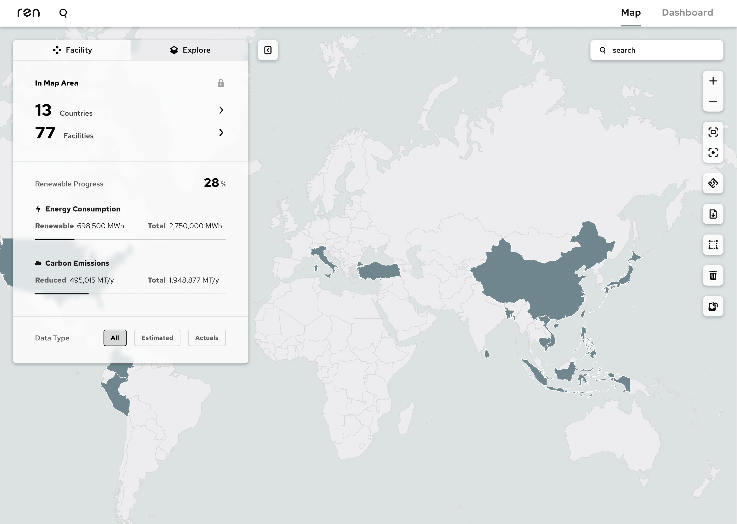
Feasibility Filter; Figma, Produced by Amruta Bhavsar and Zhiyang Li
Use Case 2: Feasibility Explorer to understand options
Final Feasibility Explorer; Figma, Produced by Amruta Bhavsar and Zhiyang Li
UNDERSTANDING THE SCOPE
Ren Energy's operations team has to spend way too much time manually cross-referencing spreadsheets
The goal of Ren's platform is to make it simpler for companies to build renewable energy portfolios by targeting the different tiers of their supply chains. To quickly understand and take into account these differences while building energy portfolios for clients, the Ren platform needs to include a feature that allows users to see what is currently feasible, where that is, and what those feasibility factors will look like in the future.
What are feasibility factors?
This project was all about feasibility factors, which in the context of renewable energy is any external reason (lack of development, country laws, etc.) an energy procurement method may or may not be available. For example, in Vietnam, there is no precedent for offsite PPAs (power purchase agreements) which would make an offsite project much less feasible there, while the U.S. has access to many kinds of purchase agreements, giving it a higher feasibility probability. Thus, the varying degrees of “development” in different countries results in certain technologies and methods of energy procurement being available in some but not others.
Primary research with the operations team
I started by familiarizing myself with the renewable energy sphere and learning the jargon. In my first week, I did a lot of research about similar companies and how they compare to Ren’s platform as well as research about different types of energy contracts and just general information regarding the feasibility factors that go into building an energy portfolio.
Because the Ren operations team was the current primary user, I spoke with them to better understand their needs. At the time, they had been checking feasibility through cross-referencing a bunch of spreadsheets and didn't want to have to do that anymore. Here were the most important things I learned from our discussion:
-
Primary users (operations team) need to be able to quickly create viable energy portfolios
-
There are lots of binary choices that need to be considered, including availability of rooftop solar, metering, and other energy procurement methods
-
The kinds of energy contracts that can be signed in different countries must be factored in
-
The rules and regulations of different countries must be factored in
-
How quickly a project can get done and how readily available developers are must be factored in
Next, I played around with the Ren platform to better understand it and figure out the journey a user would take when interacting with it. To clarify the current workflow, I created a diagram documenting the steps you can take within the platform including how feasibility factors would influence how users figure out which facilities to include.

User flow diagram of Ren platform system; Produced by Amruta Bhavsar
IDEATION
Clarifying what needs to be built
Low-fidelity hand sketch brainstorms
After I felt like I understood the problem and the way the platform functioned well enough, I started creating some preliminary sketches of how the feasibility feature could manifest in the platform. The operations team told me they check for feasibility in conjunction with the map page so it only made sense to create an array of designs where it could exist within that.
As I made these sketches, I showed them to my supervisor and the operations team for feedback. Over the course of these sessions, we collectively realized that there would need to be a few tiers to this feature: facility, state/province, and country.


Hand drawn sketch ideations; Produced by Amruta Bhavsar
Uncovering a separate use case
My team conducted numerous interviews with our target users, and in many of those the operations team mentioned they'd use the filter to "see what's possible". At first, we all took this as meaning seeing what's possible in a specific portfolio they were building, but as we dug deeper in more interviews, both the operations and my design team realized they could benefit from viewing feasibility out of context, especially when discussing strategies with clients. We learned that the operations team was actually describing two separate problems to solve for.
-
Use Case 1: Building a portfolio
-
When building a portfolio, the user needs to sort by feasibility to understand its viability
-
Only facilities that meet a filtering criteria should show up on the map
-
-
Use Case 2: Exploring options
-
Show clients what methods are available and where through the platform
-
Understand the policies and reasoning why there might be a factor with a lower probability and success rate or why something is easier to get done
-
This insight led us to working on a filtering as well as an exploration mode.
FILTER
Filter Iterations

Storyboard of feasibility filter feature; Produced by Zhiyang Li
To tackle the portfolio-building aspect of the platform, we decided to design a filter which would immediately point out which facilities could be included based on a set of feasibility criteria. We tested each of the below ideas on the operations team and got their feedback. We started with more creative and unique filtering concepts and continued pulling back and back until we reached the final, most usable design.
Round 1: Separate modals and color coding
Idea: In this first iteration, we thought about how the feasibility information should be displayed within the platform. Normally, there is a panel on the left side that shows different pieces of information about what the user is viewing on the map, so we experimented with a design that wouldn't interfere with that and simply show up as its own modal after collapsing the main one. This design also uses icons to represent the different types of feasibility factors.
Feedback: The problem with this design though was that the user would have to click into each country separately to view the feasibility information and cross-reference the country cards.

Feasibility Filter V1; Figma. Produced by Zhiyang Li
Idea: In another iteration, the original left panel remains the same and the feasibility feature shows up as an option in a toolbar on the right side. This filter displays the probability of different facilities being feasible and that of the overall clusters. It utilizes a color code ranging from red (not possible) to green (highly probable).
Feedback: Here, the issue was that all the facilities still showed up even if they were not feasible, thereby giving an overall view of the country's feasibility but not allowing the user to automatically select all facilities of a high probability. The color code also was not entirely necessary and could interfere with the existing color palette.

Feasibility Filter V2; Figma. Produced by Amruta Bhavsar
Round 2: Pop-up tags and filter within the search function of the existing left panel
Idea: In this version, we continued experimenting with the feasibility feature within the toolbar as well as the color-code for the overall country and feasibility factors. Here the user could see how many of the existing facilities match the filter criteria and select them by clicking each pop-up while still being able to view all facilities in the area.
Feedback: This method allowed the user to select all viable facilities, but didn't filter them all at once and forced them to manually select the pop-ups, so it still didn't quite hit the mark. We also determined the easiest way for the user to find what they were looking for was to hide all facilities that didn't match the filter criteria.

Feasibility Filter V3; Figma. Produced by Amruta Bhavsar
Idea: The next iteration explored how we could include the feature into the existing left panel. Facilities would show up in a list and the filters could show up as chips which filter what shows up in the list when selected.
Feedback: Because the left panel already had space for the other filtering categories (scope and type), we decided it didn't make sense to create a separate panel for filtering and place it on top of other information the user may want to see.

Feasibility Filter V4; Figma. Produced by Zhiyang Li
Round 3: Separate section within left panel vs nesting it under "Facilities"
Idea: We still liked the chip style as a differentiator, so we decided to give the filter its own section in the left panel. Additionally, we thought about showing the number of facilities that are selected and whether the overall probability is a “yes, maybe," or "no.”
Feedback: When the facilities tab is opened, there are a few other filters and that is usually where our target user would start building a portfolio, so we realized it didn't make sense to keep this filter outside of that section.

Feasibility Filter V5; Figma, Produced by Amruta Bhavsar
Idea: In the next iteration, we nested the feasibility filter under the facilities section where it would remove all facilities on the map that don't match the criteria. It was structured exactly the same as the other filters to ensure homogeneity between the concepts.
Feedback: While this idea fit into the rest of the panel seamlessly, there was still the issue of including the probability options that the other filters didn't need.

Feasibility Filter V6; Figma, Produced by Zhiyang Li
Final Filter: A separate but homogenous section of the left panel
In the final iteration, we included the filter in the same homogenous style as the other filters under facilities, but they are within separate categories. After clicking one of the checkboxes, a set of probabilities in a chip format are shown with high probability selected as a default. When testing this on our operations team, we found this was the most successful design and would be the easiest for them to build energy portfolios with.
Final Feasibility Filter; Figma, Produced by Amruta Bhavsar and Zhiyang Li
EXPLORE
Explore Iterations

Storyboard of feasibility explore feature; Produced by Zhiyang Li
The next phase of this project was to design the exploration feature of the product. This option would be useful because our users described wanting to show their clients what kinds of energy projects they can do in different parts of the world.
Round 1: Offshoot of filter vs. separate entry point
Idea: In this first iteration, we thought about including the explore feature in conjunction with the filter. We also experimented with the color-coding once again as some type of heat map may have been more useful in this situation. The user would be able to toggle between the explore view and default view with a button that existed down under facilities.
Feedback: Because the filter and explore use cases are very different and would be unlikely to intersect, the explore toggle didn't need to be near the filter and could confuse the viewer if the visual feedback of the map doesn't respond to changes in the filter settings.

Feasibility Explore V1; Figma. Produced by Amruta Bhavsar
Idea: Another entry point idea for the Explore feature was a toggle at the top of the screen and away from the filters, which would allow users to use the "Build" mode to build portfolios using the left panel and use "Explore" mode with it as well. The different facility types would also be shown as little circles across the country selected.
Feedback: There was a similar problem with this idea as the first. Because the left panel looks virtually similar to the default view (not counting the change from checkboxes to radio buttons), it could be confusing to the user which mode they are in or need to be in to accomplish a task.

Feasibility Explore V2; Figma. Produced by Amruta Bhavsar
Round 2: Heat map and list view
Idea: In this version, we went back to the heat map idea and changed the colors to different shades of blue so they'd fit the overall style better. Instead of a toggle, we considered if there could be different modes nested within a map tool and a second feasibility filter there as well.
Feedback: The heat map worked better visually but labeling the default as "Explore" and this view as "Feasibility" could cause confusion for the user about where they can build the portfolio based on feasibility versus simply viewing what's possible in different regions.

Feasibility Explore V3; Figma. Produced by Zhiyang Li
Idea: The below idea was more focused on furthering filtering capabilities but we considered a list view that would allow users to sort and filter facilities based on a table format if that was something they were more familiar with.
Feedback: Pairing this kind of table view with the left panel felt redundant and didn't really make sense within the platform. Because the use case for the explore feature was also to show clients what was possible, this view also wouldn't really visually depict what it needs to get across.

Feasibility Explore V4; Figma. Produced by Zhiyang Li
Round 3: Tabs in left panel and a separate filter
Idea: We went back to the heat map and considered creating tabs in the left panel for a "Facility" mode and an "Explore" mode. Within the panel would also be a legend communicating to the user what the color coding means in terms of feasibility.
Feedback: The tabs at the top take up a lot of space in the panel and placing the legend at the bottom could get lost if the user unfolds a lot of items. Giving the feasibility factor list its own section on the "Explore" tab worked well though and was less confusing than using the filters under facilities.

Feasibility Explore V5; Figma, Produced by Amruta Bhavsar
Idea: In this iteration, we moved the legend to the top of the panel and made the tabs smaller.
Feedback: We ran into the opposite problem with the legend, as if the user unfolds some items and scrolls down, it will get lost again.

Feasibility Explore V6; Figma, Produced by Zhiyang Li
Round 4: Breakdown bar and write-ups
Idea: I created a new iteration with simpler tabs in the left panel and an interactive facility breakdown bar showing how many facilities correspond to a feasibility criteria. Additionally, there could be a write-up for that feasibility factor detailing what a certain option looks like in a particular country or province.
Feedback: The tabs at the top take up a lot of space in the panel and placing the legend at the bottom could get lost if the user unfolds a lot of items.

Feasibility Explore V7; Figma, Produced by Amruta Bhavsar
Idea: In this version, the legend appears at the bottom of the screen in the center. There is some text at the top confirming what area the user is looking at and what the information on the left panel corresponds to. There are multiple area factor write-ups at the bottom of the panel and a much thicker, clickable facility breakdown bar.
Feedback: The panel could get long if the write-ups are not collapsable and the viewing area text is not too important to include on the map as it can just exist as a label on the left panel. The breakdown bar could be a good way to select certain facilities and toggle back to the portfolio building view.

Feasibility Filter V8; Figma, Produced by Amruta Bhavsar
Final Explore: Refining the visual style of Round 4
The final design for the "Explore" half of the feasibility feature made use of the cool-toned heat map, tab switcher between map modes, legend in the bottom left corner, and a separate filter section. The left panel depicts a bar breaking down the number of facilities that correspond to one of the four given probabilities for the selected feasibility features and accordion-style write-ups with a respective probability rating. We tested this version one last time on the operations team and they were pleased with the result. The breakdown bar seemed to be especially useful; they'd never thought about it initially but found it could help start portfolios quicker.
Final Feasibility Explore; Figma, Produced by Amruta Bhavsar and Zhiyang Li


KEY TAKEAWAYS
What I learned
Collaboration drives innovation
From this internship, I learned how powerful collaboration can be. In the initial brainstorming stage, my coworker had not yet joined the team so I had been ideating on my own. I found myself generating concepts through a limited scope and particular lens. Once he had been onboarded however, and we were able to bounce ideas off of each other, it became easier for me to step out of my view and ideate off of his perspective as well.
Keep asking questions to your target users
Something else I learned from this experience was how important it is to continue seeking to uncover your target user's real needs. The operations team told us what they thought they needed, but through digging deeper in interviews, we uncovered alternate needs they hadn't even realized they'd need to satisfy in the future.
Next Steps
If I were to continue this internship or do the project over in the future, there are a couple things I would do differently:
-
Spend more time collaborating with other designers during the early brainstorm stages.
-
Seek out more people like the operations team to test the final concepts on.
